
It's not as bad as you might think
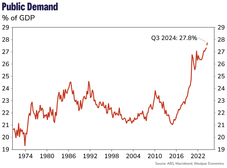
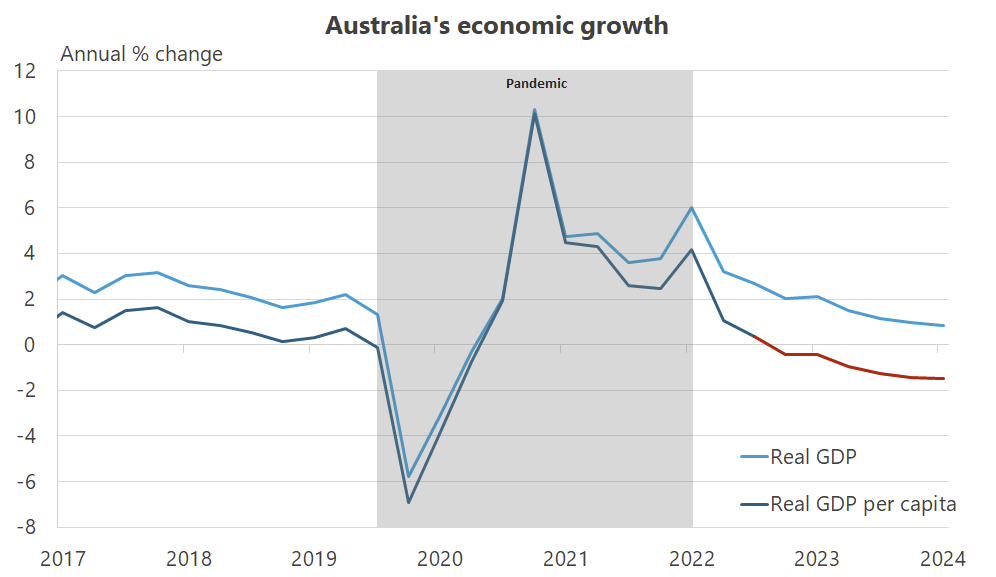
Australia’s National Accounts data for the September quarter were released this morning, and let’s just say they weren’t pretty. Real GDP increased by just 0.8% from a year ago, levels usually only seen prior to or following recessions. Worse, the growth was entirely due to state and federal government spending, which made its largest contribution since 2012:
“As a result, new public demand will climb to 27.8% of GDP in Q3 – a new record high. This quarter was not only about spending. Governments also borrowed big to pay for this additional spend, with net public borrowing a whopping $40bn in Q3, the largest quarterly borrowing amount since the lockdowns in 2021. This equates to around $1.7k in borrowing for each member of the working age population.”
So much for the “temporary and targeted” increase in the public sector’s share of spending in response to the pandemic:
But governments borrow to invest in the future though, right; surely this spending will pay for itself many times over? Probably not this time:
“A raft of state and federal government cost-of-living measures, rising public sector wages and the expansion of the care economy are undergirding persistent growth in public consumption which rose 1.4% for a second consecutive quarter and is up 4.7% over the year to the September quarter.
The quarterly public impulse was made even more significant by significant upward revisions to the level of public spending over the prior year. In total, the upward revisions total nearly $34bn or around a 5 percent upgrade to annual spending over the 2023-24 financial year.”
All of this has happened amidst an inflation problem caused by too much spending (or as economists would say, aggregate demand-induced inflation) with an unemployment rate hovering at multi-decade lows. What I want to know is if this is what our state and federal government politicians do in normal times, what can we expect from them if we were to encounter an actual crisis?
Now, you might be tempted to say that times are already tough; that Australia’s growth is slowing and the real per capita recession ticked into a seventh consecutive quarter in September, contracting -1.5% from a year ago. And you would be correct:
But I worry that the per capita data might be leading people astray.
For example, last week the AFR’s economics correspondent, Michael Read, published a provocative article that summarised the depths of despair that Australia finds itself in. It’s the latest of many such commentaries – including those that have appeared on Aussienomics – about Australia’s ongoing per capita recession, real wage decline, suffocating taxes, and migration surge.
Essentially, we’ve done really poorly compared to most other advanced economies according to a few regularly-used indicators:
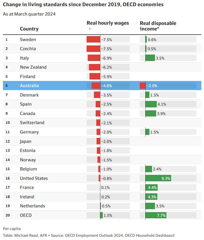
Both indicators are on a per capita, i.e. per person, basis. For example, the OECD calculates real hourly wages “by dividing the national-accounts-based total wage bill by the average number of employees in the total economy, which is then converted in full-time equivalent unit by applying the ratio of average usual weekly hours per full-time employee to that of all employees”.
Real disposable income is calculated in a similar way, by taking the sum of household final consumption expenditure and savings per capita.
These are fine proxies for living standards when nothing unusual is going on. We should all want average real wages and disposable incomes to grow; in the long run, that’s what happens when we’re more productive and have more wealth to go around. But in the short run, statistical quirks can make them look much worse than they actually are for the average Australian.
Take the following thought experiment. You’re in a pub with half a dozen mates and in walks Gina Rinehart, Australia’s richest person. Obviously the average wealth of everyone in the pub would increase; no one in the country has as much as Gina! But has your wealth increased? Absolutely not, and using the average in this case is misleading: the average doesn’t represent the economic reality for most people in the pub!
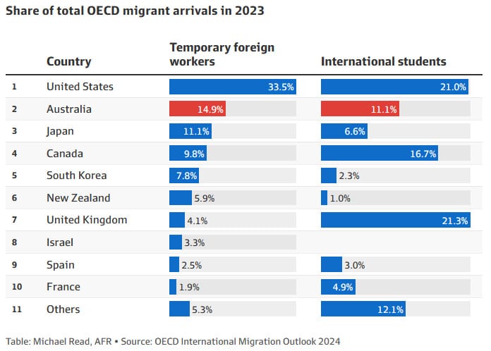
Economists and statisticians call this a composition effect, and it has affected the data in Australia more than most other countries because of our disproportionately large post-pandemic surge in migration (Canada is another example). Michael Read’s article has a second table showing that “Australia welcomed 15 per cent of all temporary labour migrants across the OECD last year, despite representing just 1.9 per cent of the group’s population”:
Basically, the large and sudden inflow of migration – mostly temporary visa holders such as students and backpackers – caused the denominator (population) to increase. But because those people tend to work fewer hours in lower-wage, lower-productivity jobs than the permanent resident population, they also don’t raise the numerator (total income) by as much as adding another average Australian would.
Other factors may have also had the effect of reducing real wages. For example, Stanford’s Steven Davis found that the rise in working from home “raised the amenity value of employment in many jobs and for many workers”, reducing the upward pressure on nominal wages. A paper by Adam Ozimek and Eric Carlson showed that the growth in remote work caused “a surge in household formation”, reducing measured household incomes.
Under such conditions, it’s perfectly consistent to have falling real GDP per capita at the same time as everyone is better off: Australians because their wealth hasn’t been negatively affected due to migration, and migrants because if they didn’t want to be here, they wouldn’t be (revealed preference is a powerful signal!).
Are some people, and some goods and services, now worse because of the increase in migration? Absolutely; for example, housing is one area where migrants have likely made the situation worse for some (but better for most because 66% of households own their home). But that’s only because we have poor housing and infrastructure policies in place.
The average migrant has a more positive fiscal impact over their lifetimes than the average Australian-born person, so they effectively subsidise services for the rest of us. If migrants are worsening structural issues in Australia, then policymakers should be trying to solve those issues, for example through supply side (land use zoning) and efficiency measures (tolls, congestion prices, water usage charges, etc), rather than slamming the door shut through poorly conceived policies such as quotas.
Michael Read isn’t alone in reading too much into Australia’s per capita woes. If you spend any time on socials, you’ll see things like this:
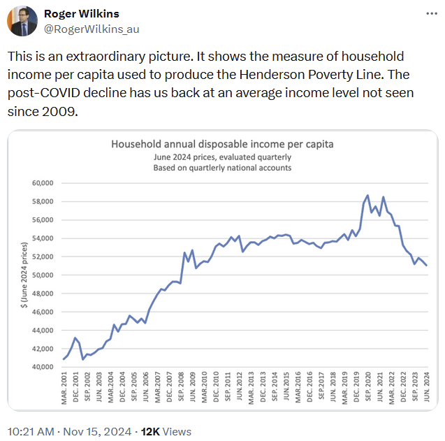
Wilkins is an economics professor at the University of Melbourne. He’s not drawing any inferences here, but the use of “extraordinary” certainly leads one to believe that he thinks it’s a big problem that needs to be addressed. When the media pick comments like this up, they tend to do the inferring and frequently get it wrong.
It’s important to remember that averages are simplifications that can hide nuanced, complex underlying realities. You need a theory to guide you; a foundation upon which you are able to interpret the data, or your analysis might lead you to the wrong conclusions, or to support policies that may cause more harm than good.
Yes, the data look bad. But in reality, the Australian economy is not in recession, real GDP growth is still positive, unemployment is low, and inflation is well down from its peak. Many – perhaps most – Australians are better off than they were in December 2019. Real incomes per capita have even started to increase again, and are almost back to those 2019 levels despite the large increase in migration:

But that doesn’t mean it couldn’t be better, or that the GDP figures and the huge amount of government debit-financed spending aren’t hiding a more grim reality.
Comments
Comments have been disabled and we're not sure if we'll ever turn them back on. If you have something you would like to contribute, please send Justin an email or hit up social media!